
How it helps
Use it for a focused task
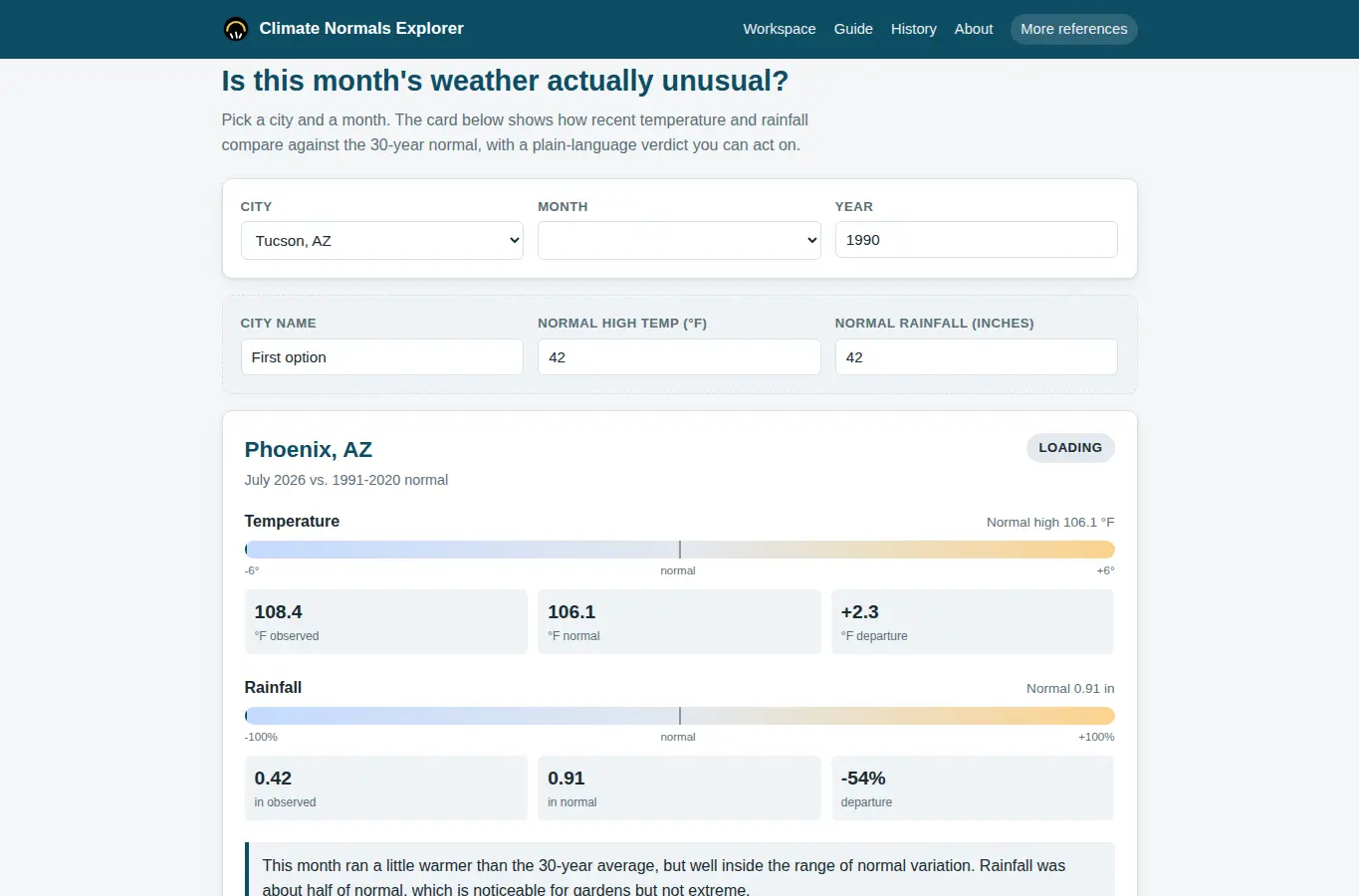
The page opens with a focused comparison workspace: pick a city and a month, and the card instantly shows how this year's temperature and rainfall stack up against the 30-year normal. Below the workspace, a short guide explains how normals are calculated, common mistakes people make when judging weather, and what counts as a meaningful deviation.
Choose a city from the dropdown and a month from the picker. The comparison card updates immediately.
Read the plain-language verdict to understand how unusual the month was. Use the save button to keep a local record, the copy link button to share, or the print button to get a clean card.